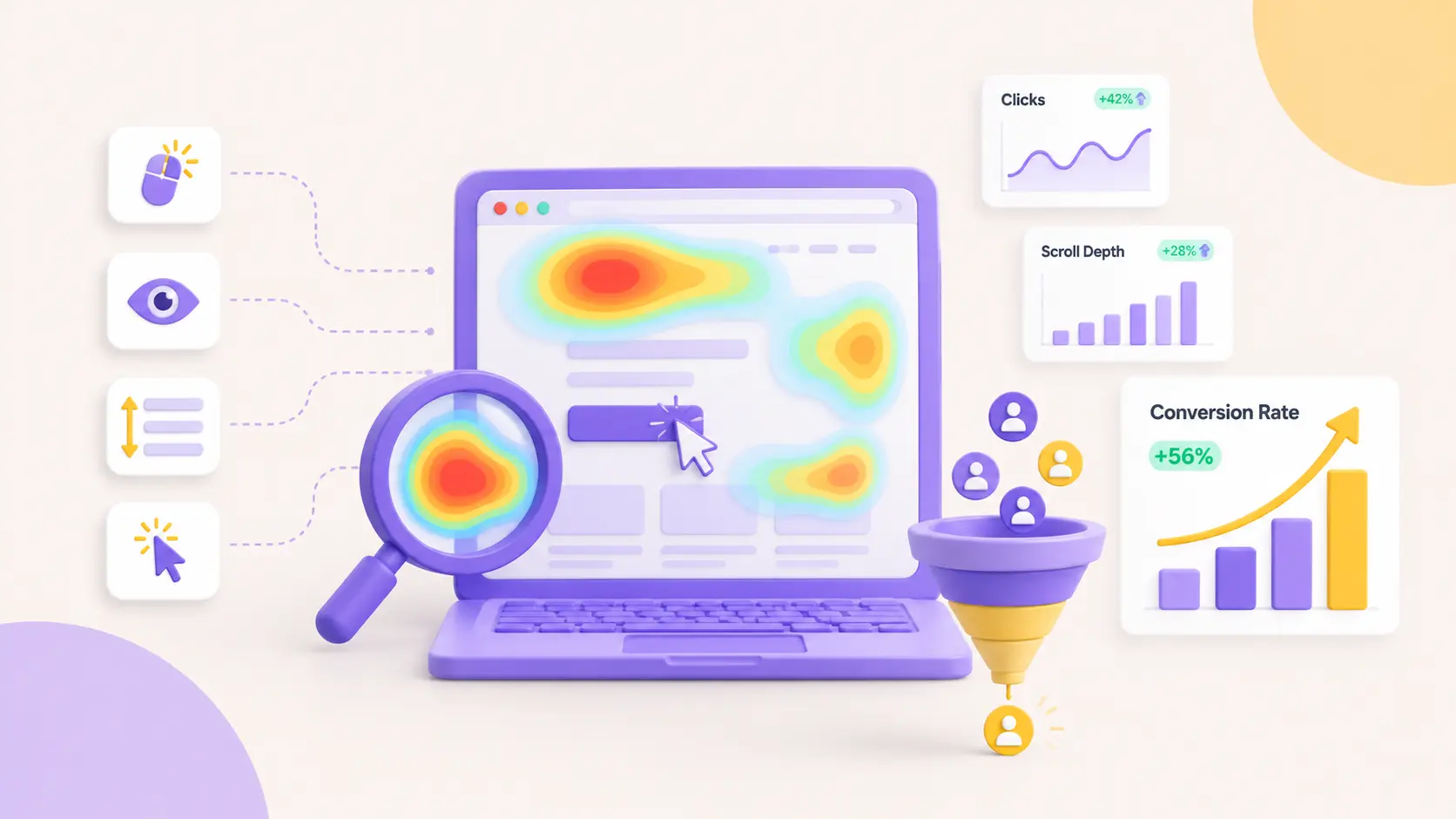
How to turn heatmaps, session recordings, and behaviour data into conversion decisions, using the exact playbook we ran at Builder.ai.
Heatmaps are the most-installed, least-used tool in marketing. A team signs up for Hotjar, watches a few session recordings in the first week, nods at the pretty red-and-blue overlays, and never opens it again. The tool becomes wallpaper.
That is a waste, because a heatmap is not a report. It is a list of decisions waiting to be made. I ran CRO at Builder.ai during its high-growth years, and heatmaps and session recordings drove some of the highest-leverage changes we made. Not because the tools were clever, but because we treated every pattern as a question: what do we actually do about this?
This is that playbook. Three real insights from our own data, and the decision each one led to.
Less theory, more “here is what to look at and what to do when you see it.”
Stop treating your behaviour tools as one thing
“Heatmap” is really a set of different tools wearing the same coat. Read each one for what it actually answers:
- Scroll maps: how far down the page people get. Is anyone even seeing this section?
- Click maps: where people tap and click. What are they trying to do?
- Move maps: where cursors hover (a rough, imperfect proxy for attention). What is pulling their eye?
- Rage and dead clicks: frantic repeated clicks, or clicks on things that are not clickable. Where are we frustrating them?
- Session recordings: the full journey of one real person. Why did this specific visitor behave the way they did?
The insight almost never comes from one of these on its own. It comes from reading two against each other, or filtering one down to the exact people you care about. All three stories below do exactly that.
The scroll pattern you will always see, and the wrong lesson
Look at enough scroll maps and the same shape shows up on nearly every page:
- Above the fold: around 90% or more of visitors.
- Middle of the page: drops to 50 to 70%.
- Near the footer: almost nobody.
The lazy conclusion is “people do not scroll, so cram everything up top.” That is the wrong lesson, and it makes pages worse. You end up with a bloated hero and a graveyard below it.
The right move is to go panel by panel and cross-reference scroll depth against clicks and hovers. What you are hunting for is the anomaly: a section low on the page, with low scroll reach, that still collects a disproportionate share of clicks and hovers. That is a buried demand.
Few people are getting there, but the ones who do are reaching for it. Fix the reach and you have found free conversion.
Insight 01 · Buried demand: the industries panel
On our homepage, the fourth panel down was a high-level strip of the industries we built software for. Scroll reach to it was weak, around 30%. But the move and click maps told a different story: the people who did get that far were hovering on it and clicking into it far more than a fourth-panel section had any right to.
Low reach, high intent. Buried demand. So we did not just move the panel up. We built out what people were clearly asking for, and the sequence is the point:
- Keyword research first. We pulled what people were actually searching for by industry, the demand that existed off our site, not just on it.
- Then we talked to sales. Which industries were driving the highest revenue right now? The site data and the deal data had to agree before we committed.
- We picked the top 5 to 10 industries from the overlap of high search demand and high revenue.
- We built dedicated industry pages, structured tightly: case studies for that industry only, the interesting things Builder had done there, and the features buyers in that vertical kept missing.
- Then we brought a proper industry panel back to the homepage, linking into those new pages, and ran it as a test for three to four weeks.
Result: a 40% lift in clicks to that panel. But the click lift was not the prize. The prize was the loop it closed. Someone clicked the homepage panel, landed on the industry page, and self-identified their vertical by the pages they browsed.
Lifecycle then sent industry-specific emails, case studies and features for that exact vertical, instead of a generic drip.
Sales walked into calls already knowing the prospect’s industry and the proof points that mattered to them.
One heatmap anomaly became a website change, a content build, a segmentation signal, and a personalised email track. That is the difference between “we optimised a page” and “we built a system.” A heatmap insight should always be handed to the next team, not filed.
Insight 02 · Session recordings: the form that quietly rejected the world
Session recordings have one big problem. Give it a few weeks and you have thousands of them, all sampled, and no idea which to watch. Opening recordings at random is exactly how the tool ends up as wallpaper. The trick is to stop watching recordings and start watching a segment.
We wanted more form fills. The funnel showed the problem clearly: plenty of people started the form, but nearly 30% who started never submitted. So instead of scrolling through random sessions, we filtered the recordings to one specific group: people who fired the Form Start event but never fired Form Submit. That turned thousands of recordings into a short, focused watchlist of people failing at the exact step we cared about.
Within a handful of those recordings, the pattern jumped out. We watched people fill in every field, click Submit, and nothing happened. No confirmation, no visible error. They clicked Submit again. Still nothing. Then they left. In the click map, this showed up as a tight cluster of dead clicks right on the Submit button.
The cause was tiny. Builder.ai was a global product, and people were filling the form from all over the world. The phone number field only accepted a local, UK-style format. Anyone entering a number with a country code failed validation, and the error message rendered above the field, out of view once they had scrolled down to the button. So from the visitor’s side, Submit simply looked broken.
The fix took a developer an afternoon. Accept international phone formats with a proper country selector, and show the validation error inline, right where the eye already is. The drop-off shrank and form fills went up. No redesign, no new copy, no new offer.
The lesson: a big share of form drop-off is not a motivation problem or a messaging problem. It is a small technical fault nobody on the team ever hits, because you are all testing from one country, on fast connections, filling it the “correct” way. These are the low-hanging fruit that CRO usually walks straight past while reaching for a big redesign.A lot of times, the problem is not a huge change. It is almost always a small fix you could not see until you filtered the recordings down to the people it was happening to.
Do this: pick your single most important conversion event. Filter recordings to people who started the step before it but never completed it. Watch ten. You will almost always find something small, dumb, and fixable.
Insight 03 · High page views, low nav clicks: the front door you did not know you had
This one comes from putting two data sources side by side: your analytics page-views report and your navigation click map.
We noticed a page pulling serious traffic in analytics, while the click map on the main navigation showed almost nobody clicking through to it from the menu. At first glance that looks like a tracking glitch. It is not. It is one of the most useful signals you can get.
If a page has high views but hardly anyone reaches it through your own navigation, people are arriving from somewhere else: Google, an ad, an email, a link in someone else’s content. That page is not an internal destination people browse toward. It is a front door people land on cold.
For us it was the pricing page. Plenty of visits, but the “Pricing” link in the nav was barely touched. People were searching “Builder.ai pricing” and “Builder.ai cost” and landing on it directly, without ever seeing the homepage or the story that usually led up to it.
That changes how the page has to be built. Ours had been written for someone who arrived the expected way, after the homepage and a solution page, already sold on what we did. But most of its real visitors turned up with none of that context. So we rebuilt the top of the page for a cold landing: a short line on what Builder.ai actually is, who it is for, and one clear primary action, all before the pricing tables. Same page, but now it stood on its own instead of assuming a journey most visitors never took. Conversions from it improved.
The decision rule: cross-reference page views against nav clicks. Any page with high views and low nav clicks is an entry page, not a destination, so design it as a front door. Assume the visitor has zero context, restate the value in one line, and give one obvious next step. The reverse is worth knowing too. A page you have buried in the footer that quietly pulls big organic traffic is proven demand you are hiding. Promote it.
The takeaway: build the engine, not the report
Heatmaps, recordings, and analytics do not improve conversion rates. Decisions do. The tools just tell you which decisions are worth making.
The pattern under all three stories is the same:
- Observe the anomaly. A section with low reach but high intent. A cluster of dead clicks on a button. A page with high views and no nav clicks.
- Narrow it down. Cross-reference two data sources, or filter recordings to the exact people the problem is happening to. The answer is never in the aggregate. It is in the segment.
- Change one thing. A panel, a phone field, the top of a pricing page. Usually small.
- Hand it off. Feed the finding to sales, lifecycle, product, or engineering, so one insight compounds across teams instead of dying on a page.
Do that, and Hotjar stops being wallpaper. It becomes the thing that tells you where the next win is hiding.
FAQs
How do heatmaps help improve website conversions?
Heatmaps reveal how visitors scroll, click, and interact with a page, helping teams identify buried content, usability problems, and high-intent areas that can be optimized for more conversions.
What is the difference between heatmaps and session recordings?
Heatmaps show aggregated behaviour patterns across many visitors, while session recordings let you watch individual user journeys and identify specific friction points or technical issues.
How can session recordings help reduce form abandonment?
By filtering recordings for users who start but do not submit a form, you can identify validation errors, broken interactions, confusing fields, and other issues causing visitors to abandon the conversion process.
What are rage clicks and dead clicks in heatmap analysis?
Rage clicks are repeated clicks that often indicate frustration, while dead clicks occur when visitors click elements that do not respond. Both can reveal usability and conversion barriers.
How often should businesses analyze heatmaps and user behaviour data?
Heatmaps should be reviewed regularly alongside analytics and conversion data, particularly after significant website changes or when conversion performance declines. The goal should be to turn behavioural patterns into specific tests and improvements.