
SHORT ANSWER
Most B2B websites fail to convert because they are built like brochures, not conversion tools. The value proposition is vague, the copy is full of jargon, the call to action is weak, and the contact form asks for nothing useful. Fix those four and lead volume climbs without a single extra visitor.
Your B2B website gets traffic. It just does not turn that traffic into leads. That is the more expensive problem, and it is almost never fixed by buying more traffic.
Here is the uncomfortable part. The gap between visitors and leads is usually not a design problem or a traffic problem. It is a clarity problem. A visitor lands, cannot quickly tell what you do or why it matters to them, and leaves. No form filled. No trace. You never find out it happened.
Below are the five reasons this keeps happening on B2B websites, and the specific fix for each. Every section ends with something you can act on today.
The real problem: your website is a brochure, not a conversion tool
Ask yourself one question before anything else. Are you treating your website like a beautiful brochure, or like a place for someone to take action?
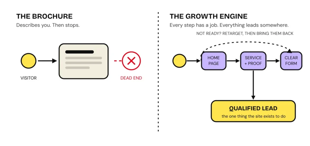
A brochure describes you. A conversion tool moves someone. Those are different jobs, and most B2B websites are quietly doing the first while the founder assumes they are doing the second. A brochure site can win a design award and still generate almost nothing, because there is no path. The visitor reads, nods, and leaves with nowhere obvious to go.
A website that converts is built backwards from the action you want. Before anyone arrives, you already know what you want them to do, and every page is arranged to make that one thing easy.
Reason 1: your value proposition is vague, or missing
This is the big one. A visitor decides very fast whether your page is worth their attention. There is a well-known UX rule of thumb, often called the 5-second rule: within about five seconds of landing, a first-time visitor should be able to tell what you do, who it is for, and what to do next. Research on first impressions suggests the initial read happens even faster than that, in well under a second. Treat five seconds as the generous version.
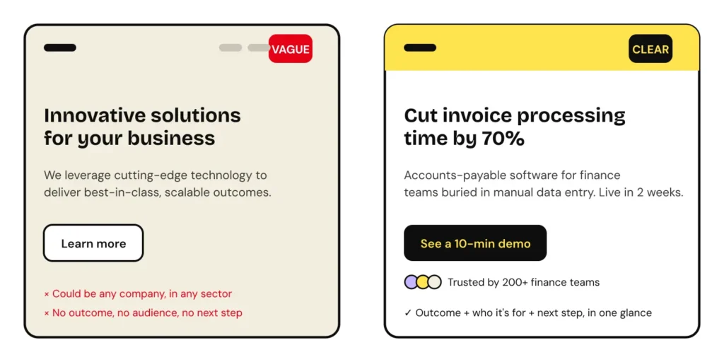
The first panel a visitor sees has to carry the weight. In two lines it should say what you do, the problem you solve, and why someone would pick you over the alternatives. Most B2B homepages instead open with something like “innovative solutions for forward-thinking businesses,” which tells the reader nothing and could belong to any company in any industry.
THE VALUE PROPOSITION FORMULA
What you do + Who it’s for + The outcome + Why you
Two lines. Lead with the outcome, not the feature. “Close 40% more deals” beats “unlimited contacts.” Then one line on why you, not the competitor. If someone outside your industry cannot understand it on the first read, rewrite it.
Fix it today: open your homepage. Cover everything except the first screen. Ask a person who does not work in your industry what you do and who it is for. If they hesitate, your value proposition is the problem, not your traffic.
Reason 2: the copy is written for engineers, not buyers
In most B2B tech companies, the website copy is written by the person who knows the product best. Usually that is someone deeply technical. The result reads like documentation. It is accurate, dense, and full of jargon, and the buyer cannot tell what any of it does for them.
Jargon does two kinds of damage. It makes the reader work to understand you, and it hides the one thing that would make them act. When a page is hard to parse, the visitor does not slow down and concentrate. They leave. And crucially, they leave without knowing what action they were supposed to take.
Clarity is not dumbing down. It is respect for the reader’s time. Say what the product does in plain language, then let the technical depth live one click deeper for the people who want it.
✗ Jargon: “Our platform enables end-to-end orchestration of your data pipeline with best-in-class observability.”
✓ Plain: “See where your data breaks, before your customers do. Set up in an afternoon.”
Fix it today: read your homepage out loud to someone outside your team. Every time they look confused, mark the sentence. Rewrite those sentences to say what the reader gets, not what the system is.
Reason 3: your calls to action don’t tell people what happens next
SaaS companies usually have this sorted. The action is obvious: start a free trial. But for B2B tech companies that are not SaaS, and for most B2B service businesses, the call to action tends to go soft. “Learn more.” “Get a quote.” “Contact us.” None of these tell the visitor what will actually happen if they click.
A weak CTA creates hesitation at the exact moment you need momentum. “Get a quote” makes people imagine a sales chase. “Learn more” promises nothing. The fix is to name the action and set the expectation inside the button and the line next to it.
✗ Weak: “Learn more.” What happens next? Unclear. So people don’t click.
✓ Specific: “Book a 20-min audit.” You’ll get one concrete fix on the call. No pitch.
Fix it today: rewrite your main CTA so it names the action and what the person gets. Then add one line underneath answering the question they are silently asking: what happens after I click?
Reason 4: your contact form asks for nothing useful
The generic three-field form (name, email, message) is a wasted opportunity in both directions. It gives you nothing to qualify the lead, and it gives the visitor no sense of what happens next. So the good leads under-share, the wrong leads still come through, and the person who submits it has no idea when, or whether, they will hear back.
If you want qualified leads, ask questions. Not too many, not too few. Enough to understand what they need so your first reply can actually be useful. Then treat the space around the form as prime real estate: set the expectation (how fast you respond, what they will get), and put a trust signal right there at the moment of decision.
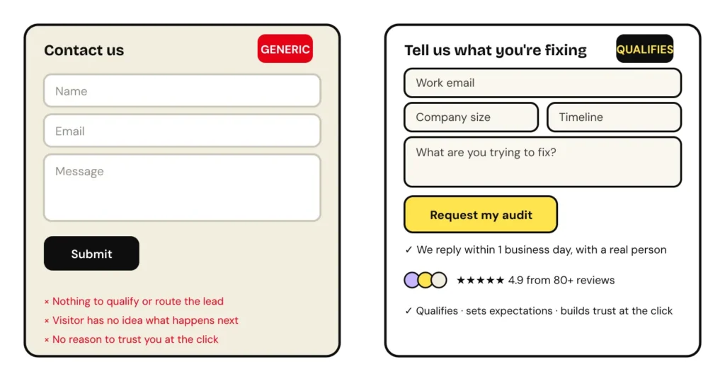
Fix it today: add two or three qualifying fields to your form (what they need, company size, timeline). Add one line setting the response time. Put one trust signal directly above or beside the submit button. Not a form. A conversation.
Reason 5: there’s no path, and no reason to trust you
Even with a clear value proposition and a good form, visitors leak out if the site gives them nowhere obvious to go and no reason to believe you. This is the structural layer, and it is where “brochure thinking” shows up most.
Work through it in order:
- Homepage focus. If you offer 30 services, the homepage should not list 30 services. It should lead with the few that matter most, the ones you want to be known for and want to sell. A homepage that tries to say everything says nothing.
- Service pages that give food for thought. Each service page should show relevant examples, a sense of how you work, and enough substance that the reader can picture the outcome. Then point clearly to the next step.
- An easy, obvious path to contact. That page should lead to a form the visitor can complete without friction. One clear action, not five competing ones.
- Confidence signals throughout. Social proof, yes. But also the small things that quietly say you are real and reachable: an office address, a phone number, and the contact channels your buyers actually prefer.
- Contact where buyers already are. If your customers are most comfortable on WhatsApp or email, put that in the navigation where they can reach you in one tap. Do not force everyone through a single form if a quicker channel would convert them faster.
Fix it today: add your phone number and preferred contact channel (WhatsApp or email) to the top navigation. It is a five-minute change that removes friction for the buyers who are ready now.
The fix, in order
If you only do a few things, do them in this sequence. Each one compounds on the last.
- Rewrite the value proposition. Two lines: what you do, who it’s for, the outcome, why you. Put it in the first screen.
- Strip the jargon. Say what the buyer gets in plain language. Move technical depth one click deeper.
- Fix the main CTA. Name the action, set the expectation, answer “what happens if I click?”
- Upgrade the form. Add qualifying questions, a response-time promise, and a trust signal at the point of submission.
- Build the path and the proof. Focus the homepage, strengthen service pages, and make contact effortless on the channels your buyers prefer.
None of this requires more traffic. It requires treating the website as a place where a decision gets made, not a brochure that describes you and hopes.
Frequently asked questions
Why is my B2B website not generating leads?
Usually for four reasons: the value proposition is vague, the copy is full of technical jargon, the call to action is weak, and the contact form asks for nothing useful. The problem is rarely traffic. It is what happens after the visitor lands and cannot tell what you do, why it matters, or what to do next.
What is the 5-second rule for a website?
It is a UX rule of thumb: a first-time visitor should be able to tell what you do, who it is for, and what to do next within about five seconds. It is a heuristic rather than a scientific law, but it reflects how quickly people form a first impression of a page.
How do I write a good B2B value proposition?
Write two lines that answer what you do, who it is for, and the outcome the buyer gets. Lead with the outcome, not the feature. Add one line on why you over the alternatives. Keep it plain enough that someone outside your industry understands it on the first read.
How many fields should a B2B contact form have?
Enough to qualify and route the lead, not so many that people abandon it. For most B2B service businesses that is four to six fields: work email, company, what they are trying to fix, and a timeline or budget signal. Ask what lets you give a useful first reply.
What is a good conversion rate for a B2B website?
It varies too much by industry, traffic source, and offer to quote a single reliable figure, and anyone who gives you one without seeing your data is guessing. Measure your own baseline first, then improve against it. A visitor from a branded search converts very differently from cold paid traffic.
Want the one thing we’d fix first?
Drop your homepage URL and we’ll tell you the single change we’d make to turn more visitors into leads.
THE LEMON THEORY · THELEMONTHEORY.COM